
One of the most persistent myths in home design is that every window treatment in a house must be identical. For decades, the “builder grade” standard was to install the same white 2 inch blinds in every room. While this provided a clean exterior look, it often resulted in interiors that felt flat, uninspired, and functionally inadequate.
As we move into 2026, the design philosophy has shifted from “matching” to “curating.” The modern home is no longer a monolith. Instead, it is a series of zones with different light, privacy, and acoustic needs.
This guide explores the new rules of coordination, the one non-negotiable rule of consistency, and how to mix styles without making your home look like a patchwork quilt.
The Street-Side Secret: The Only Rule That Matters
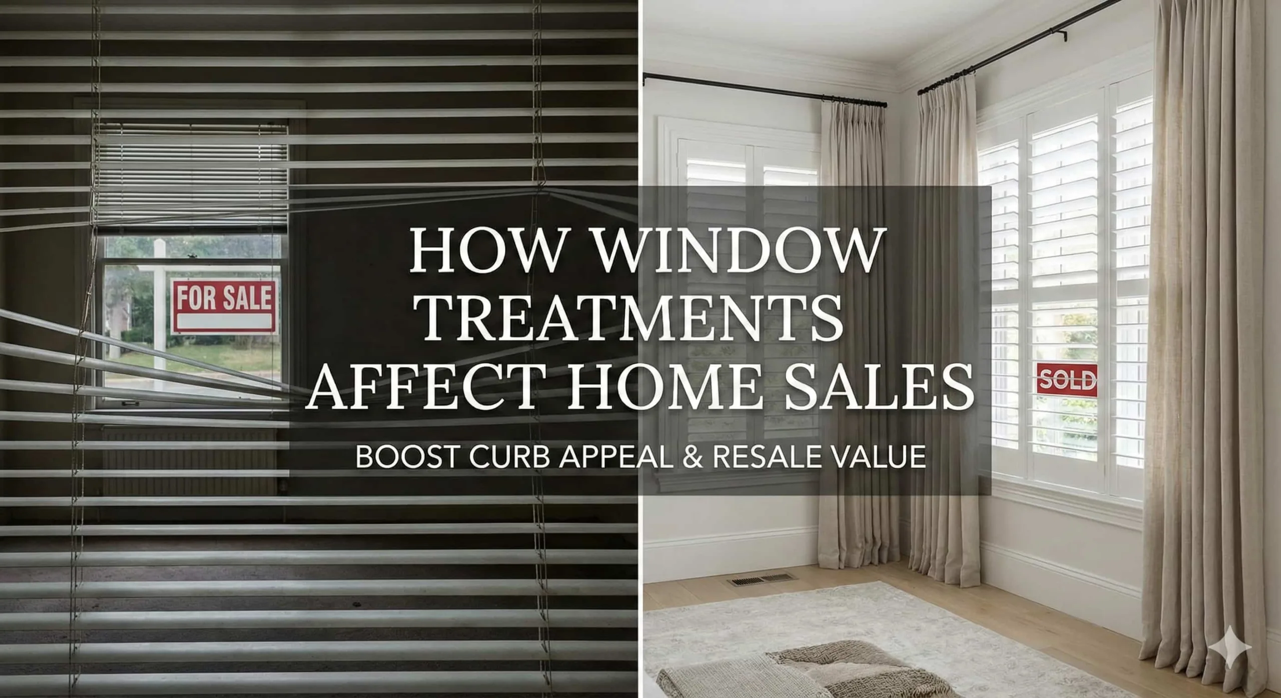
While you have total creative freedom inside your home, your windows serve a dual purpose as part of the architecture. From the outside, consistency is vital for curb appeal.
If your kitchen has dark wood shutters, your living room has blue floral drapes, and your guest room has white roller shades, the exterior of your home will look fragmented and disorganized.
The Solution: Ensure that every window treatment visible from the street has a consistent “street side” appearance. This usually means a white or off-white backing.
-
Blinds and shutters often come in white by default, making them naturally consistent.
-
For fabric treatments, utilize a high quality white lining. This allows you to have a bold navy silk drape in your dining room and a neutral linen in your living room while maintaining a perfectly uniform look from the sidewalk.
Open-Concept Coordination: Shared Spaces vs. Individual Zones
The rise of open-concept living has complicated the “matching” debate. If you can see the kitchen, dining, and living area windows simultaneously, do they all need to be the same?
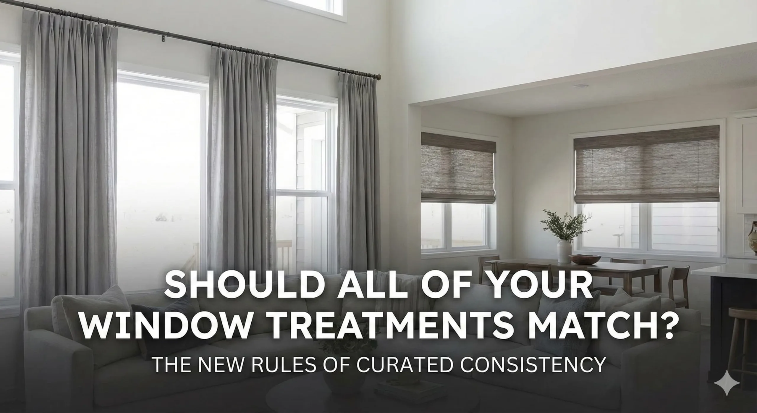
The short answer is no, but they must be “related.” In 2026, we utilize window treatments to define zones within a large space.
-
The Kitchen Zone: You may prefer the sleek, wipeable surface of custom shades near the sink to handle steam and splashes.
-
The Living Zone: You might layer those same windows with floor-to-ceiling drapes and curtains to add softness and improve the acoustics of the large, open room.
To keep these different styles from clashing, use a “Commonality Factor.” This could be a shared hardware finish (like matte black), a consistent fabric texture (like a linen weave), or a unified color palette.
The Four Pillars of Curated Consistency
If you choose not to match every window, how do you ensure the home still feels intentional? Professional designers rely on these four pillars to create a cohesive but varied look.
1. Unified Hardware
Even if the treatments themselves are different, keeping the hardware consistent throughout the house (or at least within a single floor) creates a visual “tether.” Using the same rod diameter and finish—such as brushed brass or forged iron—signals that the different window styles were a deliberate choice.
2. The Color Thread
Choose a “base” color for your window coverings, such as a specific shade of cream or grey. You can then vary the style of the treatment while keeping the color constant. A Roman shade in the bedroom and a roller shade in the office look perfectly matched if they are cut from the same bolt of fabric.
3. Structural Alignment
Maintain the same mounting height across all windows in a room. If one window has a drape mounted at the ceiling and the window next to it has a blind mounted inside the frame, the room will feel off balance. Aligning the top line of your treatments creates a sense of architectural order.
4. Smart Integration
In modern homes, the most seamless way to unify different treatments is through technology. Motorized window treatments allow you to sync the movement of a wooden blind in the den with a fabric shade in the sunroom. When all treatments rise and lower in unison, the visual consistency is reinforced by the “smart” behavior of the home.
Why “Perfect Matching” Can Be a Mistake
Attempting to force the same treatment into every room often ignores the physical reality of the space.
-
The Bedroom Reality: You need blackout capabilities and sound absorption. A lightweight sheer that looks great in a sunroom will fail here.
-
The Bathroom Reality: You need moisture resistance and total privacy. A heavy velvet drape that looks regal in the library will grow mildew and feel oppressive in a small, humid bathroom.
-
The High-Traffic Reality: Sliding doors or floor-to-ceiling glass in a hallway require treatments that are easy to move. A stationary Roman shade that works on a small window will be a daily frustration on a high-traffic door.
Summary Comparison: Matching vs. Coordinating
| Feature | Matching Everything | Coordinating (Curated) |
| Visual Impact | Clean, minimalist, predictable. | Sophisticated, layered, custom. |
| Functionality | Low (treatments may not suit room needs). | High (each room is optimized). |
| Curb Appeal | Excellent (naturally consistent). | Excellent (if white linings are used). |
| Cost Efficiency | High (bulk ordering of one style). | Moderate (specialized for each zone). |
Final Verdict
Should all of your window treatments match? No.
In 2026, the most beautiful homes are those that feel collected rather than “purchased in a set.” Your home should have a consistent “handwriting,” a shared language of hardware, color, and street-side appearance but each room deserves a treatment that honors its specific purpose.
The key to a successful project is ensuring that the “mismatch” looks like an upgrade, not an oversight.